Font Choices and Justifications
|
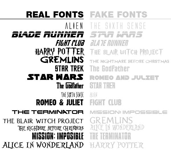
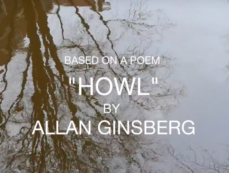
In many different OTS' the font choice is the incredibly important as it provides the feel for the film and what the film is about. If you chose the wrong font it can display the wrong signs which creates the wrong perception. The title is a very important factor in the OTS as it also reveals what the film is going to entail. For example, a psychological horror film would usually choose shape and spiky words whereas a comedy would be similar to bubble writing. |
|

|
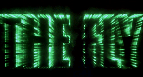
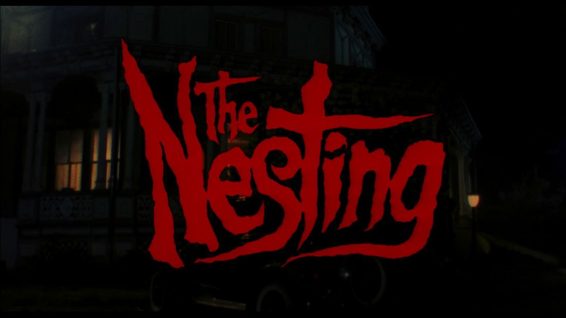
I did my research and noticed that a lot of horror movies keep their titles in simple fonts just as I wanted to, but its the visuals that add on to the creepy atmosphere. |
In contrast it's the main film title that has the most attraction to it as it's the face of the film that will be the most recognizable. Therefore I focused more on the main title to make it a little bit different font than the credits.
|
|
|
My actual title is kept simple however I feel like the rough and distorted edges add to the unstable feel it gives. The edges of the letters remind of a creepy writing from hundreds years ago, which I think matches the cultic atmosphere. The name itself is very mysterious and symbolic, as it can mean plenty of things and connotations. |
|
|
|
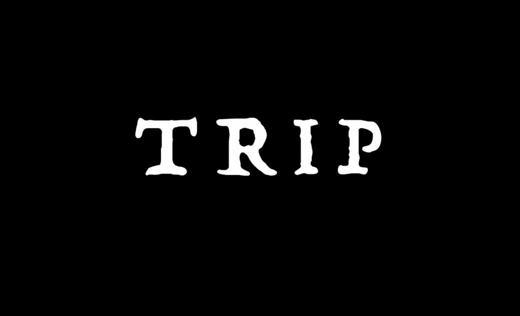
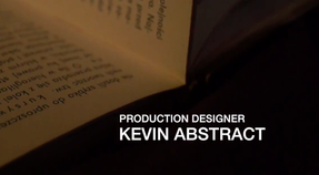
For my titles I wanted to keep them as simple as possible with a clear readable font. This is because I felt like the shots and cinematography is what the audience should focus on, and if the titles were more vibrant it would take away the serious mood of the film and the 'mature' content. The film isn't supposed to be 'fun' to watch but rather emerging in it's sinister vibe, therefore adding a floaty and eerie titles would distract from that and the audience could treat it more as a fun slasher horror.
|
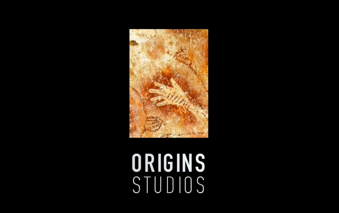
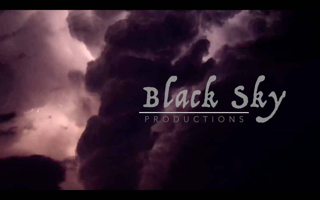
My distribution company is just on plain background, with an interesting image zooming out and then into a rectangle at the end. This was meant to me my main focus of the brand, therefore the words are easy and readable. The main word Origins is in a wider characters, emphasizing the name of the brand. The production company is what I focused on horror more. The name Black Sky is mysterious and dark in itself, and so is the font used. It's more fancy and resembling the cloudy and airy theme. The most important part of it the background and aggressive moving sky, therefore the title itself is pretty modest with small emphasis on certain aspects of the title. |
|
