EVALUATION 3
DISTRIBUTION COMPANY RESEARCH
A Distribution Company is responsible for promoting and releasing a film to the general public.
They want to create a tone at the start of the film, however their role is to show a professional ability to provide for the public and be the big sponsors. Therefore common themes to portray that are movements around the world and vast free spaces such as the sky or space, but also classic imagery that resembles their success and become memorable- objects or animals. They aim to be clear and memorable, often achieved through bold wording in their logos, coupled with dramatic and/or ambient sound. Below are some examples of major distribution company intros.
They want to create a tone at the start of the film, however their role is to show a professional ability to provide for the public and be the big sponsors. Therefore common themes to portray that are movements around the world and vast free spaces such as the sky or space, but also classic imagery that resembles their success and become memorable- objects or animals. They aim to be clear and memorable, often achieved through bold wording in their logos, coupled with dramatic and/or ambient sound. Below are some examples of major distribution company intros.
UNIVERSAL
Universal is one of the most popular distribution companies in the world, and the most recognisable one.
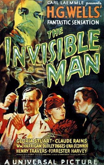
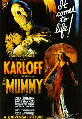
Its iconic text appearing in front of the Earth is suggest its worldwide fame and success. The font is heavy and bold, with gold details showing the power and luxury, also hints on how rich in content their films are. Universal distributes a range of different genre films, such as Unfriended, Neighbors or How To Train Your Dragon, but also horror classic such as The Invisible Man or The Mummy. The Earth is what links to that, as it spins around showing the variety of differences. In addition the music is what makes the intro epic, especially the way its building up to a climax.
Its iconic text appearing in front of the Earth is suggest its worldwide fame and success. The font is heavy and bold, with gold details showing the power and luxury, also hints on how rich in content their films are. Universal distributes a range of different genre films, such as Unfriended, Neighbors or How To Train Your Dragon, but also horror classic such as The Invisible Man or The Mummy. The Earth is what links to that, as it spins around showing the variety of differences. In addition the music is what makes the intro epic, especially the way its building up to a climax.
|

|
|
Metro-Goldwyn-Mayer Studios Inc.
This distribution company was one of the most famous and successful ones that ever existed. It had its peak in 30s and 40s, and now it's famous for doing classics such as James Bond series, Hannibal or Legally Blonde. In addition to horror they made titles like Carrie or Poltergeist.
The intro in comparison to its worldwide fame is quite basic and not as flashy. The gold film reel folds, making an important representation of logo on a simple black background. Gold refers to triumph, extravagance and quality, suggesting films made by this company are successful and prestigious. Most important is the lion in the middle. Lions are the kings of the animal kingdom, therefore having it roaring as a logo represents strength and dominance over every other company.
The intro in comparison to its worldwide fame is quite basic and not as flashy. The gold film reel folds, making an important representation of logo on a simple black background. Gold refers to triumph, extravagance and quality, suggesting films made by this company are successful and prestigious. Most important is the lion in the middle. Lions are the kings of the animal kingdom, therefore having it roaring as a logo represents strength and dominance over every other company.

|

|

|
My Distribution Company
For my Distribution company (which is the first one in the video) I went for something more organic, which resembles Origins (of the film) suggesting my production company has lots of experience and makes epic movies. I used the theme of movement, which I conveyed by using a wide shot of an ancient wall painting zooming out slowly finally into a small rectangle. I used a calm drum beat music which with the last beats turns a bit dramatic, adding the element of excitement. The black and white colours are to convey simplicity, to represent the company as professional and honest, as well as the painting suggests the earth and its natural colours.
